New Old Chair

09/30/2009

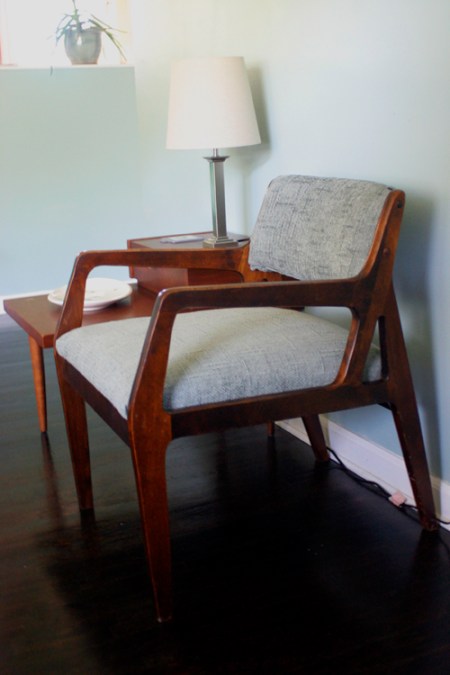
Seven years ago, when Jason and I were engaged, we attempted to re-cover one of my parents’ old chairs with a tight-fitting slip cover and new chair legs. Sadly, the cover didn’t fit well and the legs made the chair unstable. I’m happy to report that our first real chair upholstery experiment came out much better!
IMG_4341

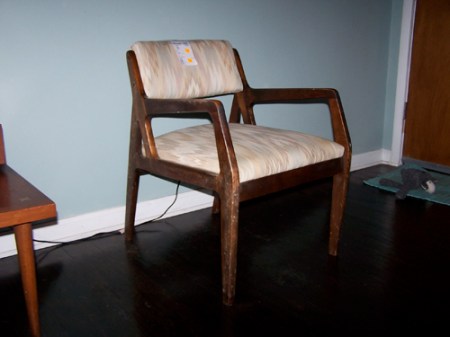
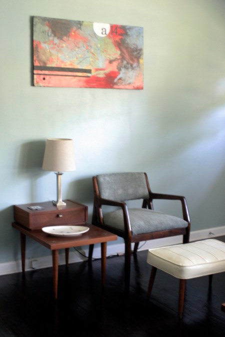
When got this mid-century chair at a thrift store for $6.99, it had this horrible off-white ’80’s zig-zag fabric. The custom upholstery tag under the chair revealed that it was not the original covering.
100_6604

Because the chair was so inexpensive, we were prepared to pay some good money for new upholstery to return it to a retro, vintage look. With a bolt of $35/yard fabric in our hands, my eye caught the clearance shelves at the fabric store. We were able to walk out with 1 1/4 yards of light blue woven upholstery (exactly what we were looking for), for only $9!
IMG_4342

(Sorry about the poor photo quality. Someday I’ll learn how to use a DSLR properly.) We had originally planned to recover the off white vinyl footstool in the same fabric. There might be just enough but it will be really close. I’m leaning towards leaving the footstool as is. It currently has an imperfection on the top from a hole that was repaired, which bothers my perfectionist husband.

What do you think? Recover the footstool? Leave it?

Advertisement

The Spice of Life

09/29/2009

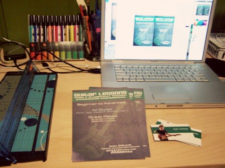
I love the variety that comes with doing freelance work. Today I finished a web site design for a dentist office, resized an ad for a masters program at a university, cut up some business cards for a guitarist and designed/printed/cut fliers for a guitar teacher. And that was all after work!

guitarlessonfliers

Tonight was some catch up work. Feels good to get a bunch of things knocked off my to-do-list after a couple of really busy weeks. (The last 2 projects listed are for my lovely husband. He doesn’t pay me but he’s still my favorite client…and if he’s successful, I benefit too, so it all comes around.)


Wise Words

09/28/2009

wisewords

“Hope that is seen is not hope at all.” — Paul


Phone Photo Friday

09/25/2009

phonephotofri

2009-09-25

My sister-in-law’s name is Ginger but she occasionally gets junk mail for Finger. It’s pretty funny.


Life is Like a Bowl of Peaches

09/24/2009

100_6600

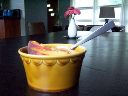
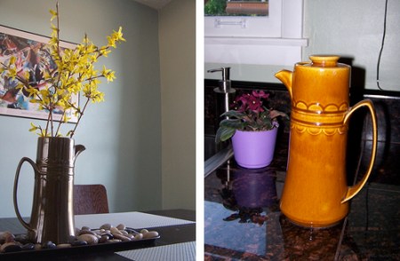
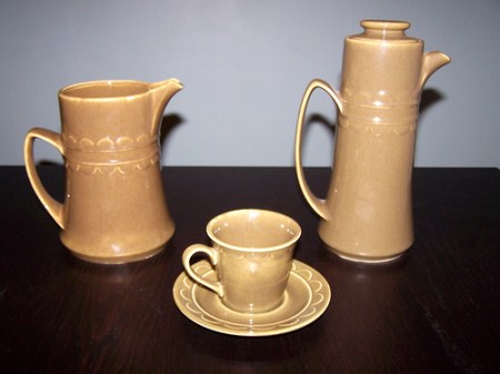
We got four of these bowls at an antique store recently. Thirty minutes prior we found 3 matching saucers at a thrift store on the same street. In May we found a matching pitcher at a yard sale. Last fall we found 2 pitchers, a dinner plate, a saucer and 5 tea cups in green in the same pattern at an estate sale. So it seems we have a bit of an unusual collection developing here.

pitchers

The pitcher on the right now belongs to my good friend and fellow MCM home owner. (Rê, I forgot to give you the lid!)

3270300173_7482519142-1

(Sorry, the above pic is really flashed out.) What drives me crazy is that I can’t figure out who makes these! There is no maker’s mark on the bottom and I’ve tried searching for mid-century dinnerware dishes scalloped half-circle pattern glazed gold green ceramic … and every combination of those words with no avail. Has anyone ever seen these?? Please help!


The Comeback Kid

09/23/2009

B.Reith

Monday night hubby and I had the honor of attending a CD preview party for B. Reith with a co-worker. (One of the perks of working for CCM.) I discovered who he is last week (through CCM’s July issue) and Jason and I quickly became fans. B.’s music is a mix of rapping and pop singing with catchy hooks (like Jason Mraz) and hip-hop beats. He can’t decide which he prefers so he does it all and it works!

b-reith-now-is-not-forever

A friend of a friend hooked up up with his new CD Now is Not Forever, which just came out on Tuesday. It’s quite a diverse mix of musical styles. You can check out his music on myspace. My self-control faltered a little as I snapped a fanarazzi picture of tobyMac and B. Reith with my phone. I’ll refrain from posting it.


Retro Starburst Clock

09/22/2009

I’ve been looking for an authentic mid-century modern starburst clock for the dining room since we moved into our house 2 and a half years ago. Oh, I can find ’em … on eBay for $70-200. But I’m looking for the ≤$20 version— the kind you find at yard sales or thrift stores or in your grandma’s basement. Speaking of yard sales, we got this modern, plastic, imitation retro clock for $3 (talked down from $5 … we’re such cheapskates).

100_6595

Jase surprised me the other day (I LOVE surprises!) by spray painting the clock face and spokes, installing new hands (the originals looked really cheap) and putting the whole thing back together. I really love how it looks now.

100_6598

But, of course, this is just temporary until we find an authentic “atomic” clock. (Like that alliteration?) And in typical Jason-and-Martina-fashion, we’ll most likely find a steal on the antique real deal and sell the modern imitation for 3-4x more money on craigslist or eBay. Cuz that’s how we roll.

100_6597

We decided to go with the white chairs in the dining room rather than the blue ones.


Judge a Book by its Cover

09/21/2009

Have I ever mentioned that I actually have a real full-time job? I mean besides collecting MCM junk from dark, dusty corners of the earth? Besides baking sweet treats and crafting? Well I do … I have a very cool job as graphic designer and art director at a Christian publishing (magazines & websites) company.

For part of my job, I collect a bunch of images of covers for books, movies and CDs that are being reviewed for a youth worker resource guide. There is a lot of good design out there, especially that which is targeted towards young professionals. And sadly, there is a lot of mediocre design, too. Occasionally a book cover design really stands out to me. Here are a few good ones from my latest collection:

books1

Ok, so the first one isn’t really that special. But isn’t that umbrella cute? Fun rain gear makes rainy days so much better. The second one isn’t super cool either but I do like the use of texture mixed with sleek graphics.

books2

I like this third one because I’m a minimalist and I like that the font is uncommon AND the title placement is creative. I’m a fan of the watercolor map of the world on the Matt Papa cover. I tried to do something once with watercolors on one of my hubby’s band’s CD design and it didn’t come out anywhere near this cool.

books3

My whole point in writing this post was to celebrate this fifth book cover. I love it! It’s got several things going for it: 1. Nice use of texture & color & depth, 2. Good hierarchy & order, 3. ORIGINAL illustration (I am so sick of seeing stock photos used on book covers!) and—what really did it for me— 4. Unique typeface. It’s so nice to see something other than the typical sans serif fonts used on a book cover.

Isn’t it lovely? Have you seen any particularly good book covers lately?


Drive-By Shooting (MCM Architecture)

09/20/2009

drivebyMCM

100_5793

Location: NW Nashville/Bordeaux


Phone Photo Friday

09/18/2009

phonephotofri

2009-09-18